#We drop all NA values so when we summarize later everything is accuratecuisines_clean <- cuisines |>drop_na()
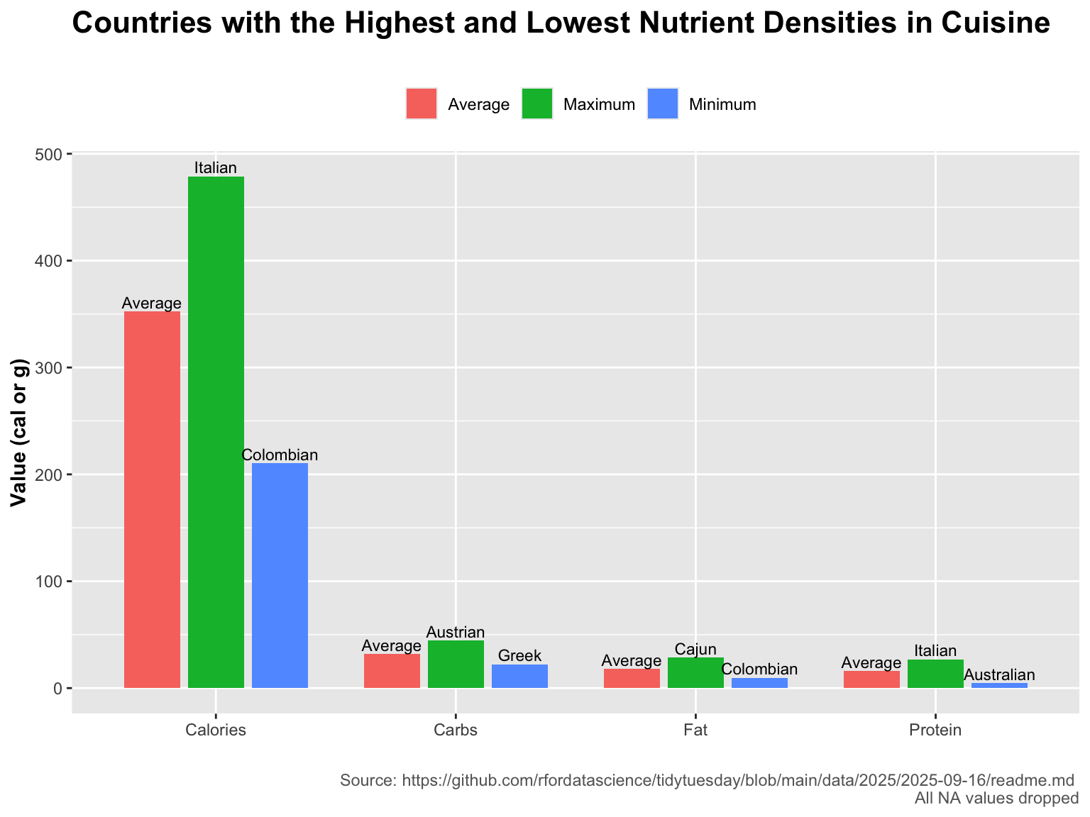
#Our research question is: which countries consistently have the highest carbs, calories, fat, and protien in their cuisine?
We developed this research question because we have a dataset of thousands of different recipies, all labelled with their nutrient amounts, as well as the country of origin of the dish. We decided this question would be a good one to pursue so we can gain insight into the cooking styles of different countries.
#final visualizationggplot(summary_extremes, aes(x = nutrient, y = value, fill = stat)) +geom_col(position =position_dodge(width =0.8), width =0.7) +geom_text(aes(label = label),position =position_dodge(width =0.8),vjust =-0.3,size =3 ) +labs(title ="Countries with the Highest and Lowest Nutrient Densities in Cuisine",subtitle ="",caption ="Source: https://github.com/rfordatascience/tidytuesday/blob/main/data/2025/2025-09-16/readme.md \nAll NA values dropped",x ="",y ="Value (cal or g)",fill ="") +theme(legend.position ="top",plot.title =element_text(face ="bold", size =16),plot.subtitle =element_text(size =10),axis.title =element_text(face ="bold", size =11),plot.caption =element_text(color ="gray40") )
Source Code
---title: "TidyTuesday2025-Week37"---```{r}library(tidyr)library(dplyr)library(ggplot2)all_recipes <- readr::read_csv('https://raw.githubusercontent.com/rfordatascience/tidytuesday/main/data/2025/2025-09-16/all_recipes.csv')cuisines <- readr::read_csv('https://raw.githubusercontent.com/rfordatascience/tidytuesday/main/data/2025/2025-09-16/cuisines.csv')``````{r}#EDA to see if data has missingness or notcolSums(is.na(all_recipes))colSums(is.na(cuisines))``````{r}#We drop all NA values so when we summarize later everything is accuratecuisines_clean <- cuisines |>drop_na()```#Our research question is: which countries consistently have the highest carbs, calories, fat, and protien in their cuisine?We developed this research question because we have a dataset of thousands of different recipies, all labelled with their nutrient amounts, as well as the country of origin of the dish. We decided this question would be a good one to pursue so we can gain insight into the cooking styles of different countries.```{r}#summarize nutrientscuisines_clean <- cuisines_clean %>%group_by(country) %>%summarize(calories =mean(calories),fat =mean(fat),carbs =mean(carbs),protein =mean(protein))``````{r}#pivot longer to create our final graphsummary_extremes <- cuisines_clean |>pivot_longer(cols =c(fat, protein, carbs, calories),names_to ="nutrient",values_to ="value") |>group_by(nutrient) |>summarise(avg_value =mean(value, na.rm =TRUE),min_value =min(value, na.rm =TRUE),min_country = country[which.min(value)],max_value =max(value, na.rm =TRUE),max_country = country[which.max(value)],.groups ="drop" ) |>pivot_longer(cols =c(min_value, avg_value, max_value),names_to ="stat",values_to ="value" ) |>mutate(stat =recode(stat,min_value ="Minimum",avg_value ="Average",max_value ="Maximum") ) |>mutate(label =case_when( stat =="Minimum"~ min_country, stat =="Maximum"~ max_country,TRUE~"Average" ) ) |>mutate(label =case_when( label =="Cajun and Creole"~"Cajun", label =="Australian and New Zealander"~"Australian",TRUE~ label ) ) |>mutate(nutrient =case_when( nutrient =="calories"~"Calories", nutrient =="carbs"~"Carbs", nutrient =="fat"~"Fat", nutrient =="protein"~"Protein",TRUE~ nutrient ) )``````{r, fig.width=8, fig.height=6}#final visualizationggplot(summary_extremes, aes(x = nutrient, y = value, fill = stat)) + geom_col(position = position_dodge(width = 0.8), width = 0.7) + geom_text( aes(label = label), position = position_dodge(width = 0.8), vjust = -0.3, size = 3 ) + labs(title = "Countries with the Highest and Lowest Nutrient Densities in Cuisine", subtitle = "", caption = "Source: https://github.com/rfordatascience/tidytuesday/blob/main/data/2025/2025-09-16/readme.md \nAll NA values dropped", x = "", y = "Value (cal or g)", fill = "") + theme( legend.position = "top", plot.title = element_text(face = "bold", size = 16), plot.subtitle = element_text(size = 10), axis.title = element_text(face = "bold", size = 11), plot.caption = element_text(color = "gray40") )```