Homework 02
TidyTuesday Section (optional)
You can count work on this week’s TidyTuesday toward the exceptional work required for an A in the Homework component.
About the Data
The Tidy Tuesday data for the week of 9/9/25 comes from the Henley Passport Index API. It includes information on the number of countries to which travelers in possession of each passport in the world may enter without going through the standard visa application process. The data is at the country level but also includes region groupings.
Driving Question: How has passport power changed over time across regions?
I began my analysis by creating a simple plot displaying the change in mean visa free count, meaning the number of countries that do not require the passport holder to apply for a visa beforehand, over time. Mean was used rather than sum so that the metric would not be skewed by the number of countries in a region.
Code
region_ranks <- rank_by_year %>%
  group_by(region, year) %>%
  summarize(reg_free_count = mean(visa_free_count))

ggplot(region_ranks, aes(x = year, y = reg_free_count, color = region)) +
  geom_line(stat = "smooth") +
  theme_classic() +
  labs(x = "Year", y = "Mean Visa Free Count", title = "Mean Visa Free Count by Region from 2006 to 2025", color = "Region", caption = "Cate Stacy, 9/16/25, Henley Passport Index")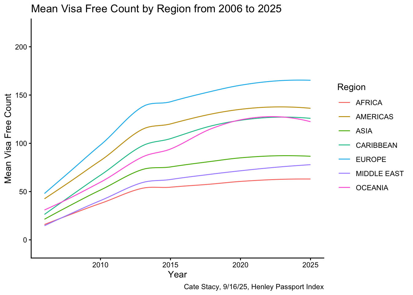
The line graph displays an increase in the number of countries passport holders can visit without applying for a visa across all regions. In 2025, Europe had the highest mean visa free count and Africa had the lowest.
Next, I explored a different measure of passport power, rank, which is highly correlated with visa free count, as seen in the scatterplot below. A lower rank indicates a more powerful passport.
Code
rank_by_year %>%
  filter(year == 2025) %>%
  group_by(region) %>%
  summarize(reg_free_count = mean(visa_free_count), reg_rank = mean(rank)) %>%
  ggplot(aes(x = reg_rank, y = reg_free_count)) +
  geom_point() +
  geom_smooth(se = FALSE, method = "lm") +
  theme_classic() +
labs(x = "Region Rank", y = "Region Free Count", title = "Region Free Count by Region Rank for 2025", caption = "Cate Stacy, 9/16/25, Henley Passport Index") 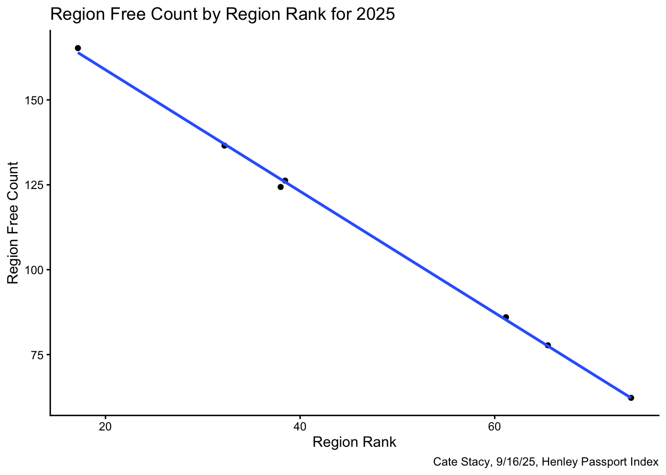
I was specifically interesting in exploring how the mean rank changed from 2006 to 2025 across regions. I chose to visualize this as a spider plot. I first had to do some data wrangling in order to compute the difference in rank for each region and format the dataframe according to the specifications of radarchart().
Code
rank_change <- rank_by_year %>%
  filter(year == "2006" | year == "2025") %>%
  group_by(region, year) %>%
  summarize(mean_rank = mean(rank)) %>%
  pivot_wider(names_from = year, values_from = mean_rank) %>%
  setNames(c("region", "yr_2006", "yr_2025")) %>%
  mutate(diff = yr_2025 - yr_2006) %>%
  select(region, diff) %>%
  pivot_wider(names_from = region, values_from = diff)

spider <- rbind(rep(14,7), rep(-10, 7), rank_change)
radarchart(
  spider,
  axistype = 1,
  pcol = rgb(0.5, 0, 0.5, 0.9), pfcol = rgb(0.5, 0, 0.5, 0.5), plwd = 2,
  cglcol = "grey", cglty = 1, axislabcol = "black",
  cglwd = 0.8,
  vlcex = 0.8,
  seg = 6,
  caxislabels = c("-10", "", "-2", "", "+6", "", "+14"),
)

title(main = "Mean Passport Rank Difference from 2006 to 2025 by Region", sub = "Cate Stacy, 9/16/25, Henley Passport Index")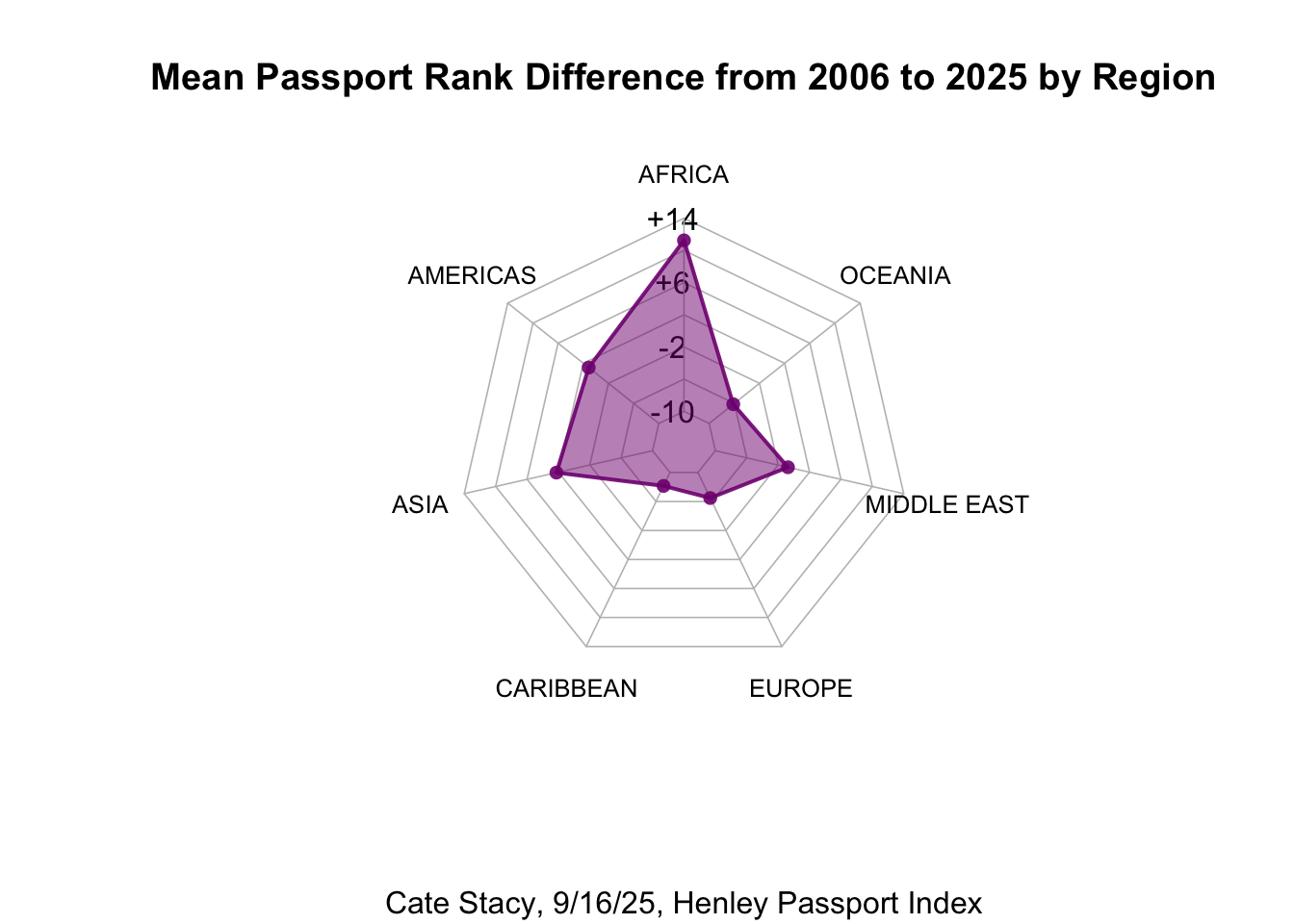
As demonstrated in the plot, Africa saw the greatest decline in passport power (~ +11) while the Caribbean saw the greatest increase in passport power (~ -8). This plot displays different patterns than the ones visualized in the line graph. While all regions saw an increase in visa free count from 2006 to 2005, not all regions experienced and increase in rank.