Homework 07
TidyTuesday Section (optional)
You can count work on this week’s TidyTuesday toward the exceptional work required for an A in the Homework component.
Explore the week’s TidyTuesday challenge. Develop a research question, then answer it through a short data story with effective visualization(s). Provide sufficient background for readers to grasp your narrative.
About the Data
The Tidy Tuesday data for the week of 10/21/25 comes from the UK Met Office, the United Kingdom’s national weather and climate service. There are two datasets, one with historical weather data, including temperature, frost, rainfall, and sun, and one with station information, including the name and year opened.
Driving Question: How have seasonal weather patterns changed over time in the UK?
For my analysis, I chose to look at spring rainfall total and summer temperature ranges. I started off by joining the datasets and creating a season variable.
Next, I identified a subset of stations to use in my analysis. I chose the five stations with the longest records and most continuous data. The five selected stations in addition to the other 32 stations can be seen in the map below.
Code
all_stations <- station_full %>%
  filter(year == 2000, month == 1) %>%
  filter(!station %in% c("armagh", "durham", "oxford", "sheffield", 'stornoway'))

station_sub <- station_full %>%
  filter(year == 2024, month == 1) %>%
  filter(station %in% c("armagh", "durham", "oxford", "sheffield", 'stornoway'))

station_map <- leaflet() %>%
  addTiles() %>%
  addMarkers(data = station_sub, lng = ~lng, lat = ~lat) %>%
  addCircleMarkers(data = all_stations, lng = ~lng, lat = ~lat, color = "red", radius = 1)

station_map
I chose to visualize spring rainfall totals for the five stations as a stream plot.
Code
station_spring <- station_full %>%
  filter(season == "spring") %>%
  group_by(year, station) %>%
  summarize(spring_rain = sum(rain)) %>%
  filter(station %in% c("armagh", "durham", "oxford", "sheffield", 'stornoway')) %>%
  filter(year >= 1890)

ggplot(station_spring, aes(x = year, y = spring_rain, fill = station)) +
  geom_stream(type = "ridge") +
  scale_y_continuous(breaks = seq(0, 1000, by = 200)) +
  scale_x_continuous(breaks = seq(1890, 2024, by = 20)) +
  theme_minimal() +
  labs(x = "", y = "total spring rainfall (mm)", title = "Spring Rainfall Totals from 1890 to 2024 at Five UK Meteorological Stations", caption = "Cate Stacy, 10/27/25, TidyTuesday")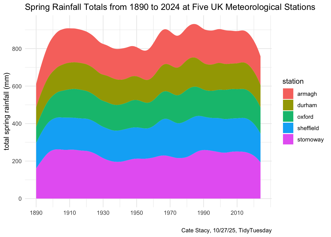
This plot demonstrates that rainfall totals tend to vary from year to year. 1910 and 1984 saw a lot of rain while there was a dip and rainfall totals from 1925 to 1960. Spring rainfall totals appear to be dropping in recent years. These patterns are seen across all of the stations. However, some stations, like Stornoway, generally receive more rain while others, like Durham, tend to receive less rain.
Next, I used line segments to visualize summer temperature ranges and average values at each of the five stations from 1890 to 2024.
Code
station_summer <- station_full %>%
  filter(season == "summer") %>%
  group_by(year, station) %>%
  summarize(
    summer_tmax = mean(tmax),
    summer_tmin = mean(tmin),
  ) %>%
  mutate(
    summer_tmax_f = ((summer_tmax * (9/5)) + 32),
    summer_tmin_f = ((summer_tmin * (9/5)) + 32),
    avg_t = summer_tmin_f + ((summer_tmax_f - summer_tmin_f) / 2)
  ) %>%
  filter(station %in% c("armagh", "durham", "oxford", "sheffield", 'stornoway')) %>%
  filter(year >= 1890)

ggplot(station_summer, aes(x = avg_t, y = year)) +
  geom_segment(aes(x = summer_tmin_f, xend = summer_tmax_f, y = year, yend = year), color = "orangered4") +
  geom_point(color="lightblue", size = 0.5) +
  theme_minimal() +
  theme(
    panel.grid.major.y = element_blank(),
    panel.border = element_blank(),
    axis.ticks.y = element_blank()) +
  facet_wrap(~station) +
  scale_y_continuous(breaks = seq(1890, 2024, by = 40)) +
  labs(title = str_wrap("Average Summer Temperature Values and Ranges from 1890 to 2024 at Five UK Meteorological Stations", 70),
       x = "temperature range (F)", y = "", caption = "Cate Stacy, 10/27/25, TidyTuesday")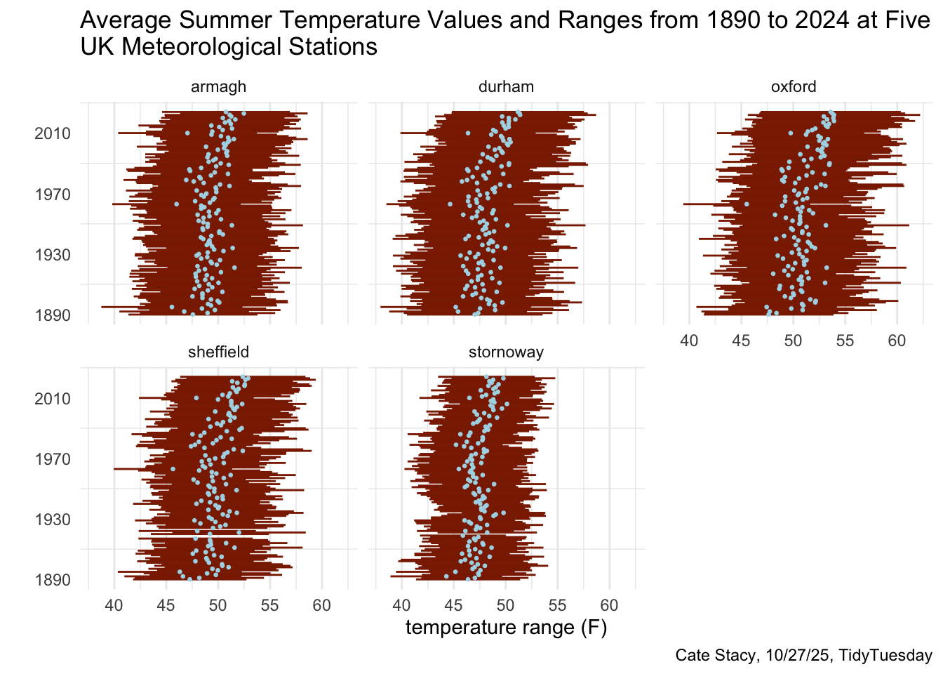
Similar to the rainfall plot, temperature ranges throughout time follow a similar pattern across each station. However, some stations, such as Oxford, have larger ranges than others, such as Stornoway. Additionally, Oxford appears to be the warmest, on average, while Stornoway appears to be the coolest.