Homework 05
TidyTuesday Section (optional)
You can count work on this week’s TidyTuesday toward the exceptional work required for an A in the Homework component.
Explore the week’s TidyTuesday challenge. Develop a research question, then answer it through a short data story with effective visualization(s). Provide sufficient background for readers to grasp your narrative.
About the Data
The Tidy Tuesday data for the week of 9/30/25 comes from the Hornborgasjön field station in Sweden which has been counting the number of cranes stopping at Lake Hornborgasjön during their yearly migration for over 30 years. The variables in the dataset include the date, number of observations, comment, and weather disruption.
Driving Question: How do crane observations at Lake Hornborgasjön, Sweden vary temporally?
I was interested in exploring how the number of crane observations has changed over the past 30 years as well as the months in which cranes are most common.
Code
cranes_new <- cranes %>%
  filter(!is.na(date) & !is.na(observations)) %>%
  mutate(
    date_obj = ymd(date),
    year = year(date_obj),
    month = month(date_obj, label = TRUE)
  )

ggplot(cranes_new, aes(x = month, y = year, fill = observations)) +
     geom_tile() +
     scale_fill_gradient(low = "white", high = "royalblue4") + # Customize color scale
     labs(title = "Monthly Crane Observations at Lake Hornborgasjön, Sweden from 1994 to 2024",
          y = "", x = "", caption = "Cate Stacy, 10/8/25, Data From Hornborgasjön Field Station") +
     theme_minimal() +
      scale_y_continuous(breaks = seq(from = 1994, to = 2024, by = 1))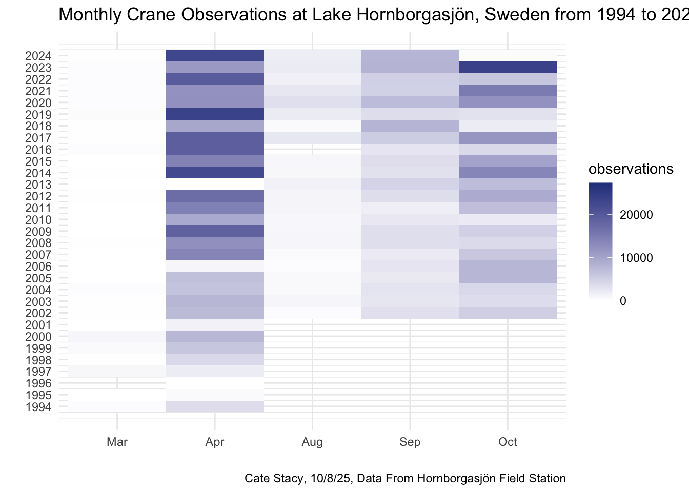
This heatmap demonstrates that the greatest number of cranes visit Lake Hornborgasjön in the months of April, September, and October. It also suggests that the overall crane population at Lake Hornborgasjön has increased over the course of the study period. We can confirm these trends by isolating month and year in two additional plots.
Code
cranes_new %>%
  filter(!is.na(year) & !is.na(observations)) %>%
  group_by(year) %>%
  summarize(mean_observartions = mean(observations)) %>%
  ggplot(aes(x = year, y = mean_observartions)) +
  geom_line() +
  theme_classic() +
  labs(y = "observations", title = "Crane Observations at Lake Hornborgasjön, Sweden from 1994 to 2024",
       caption = "Cate Stacy, 10/8/25, Data From Hornborgasjön Field Station")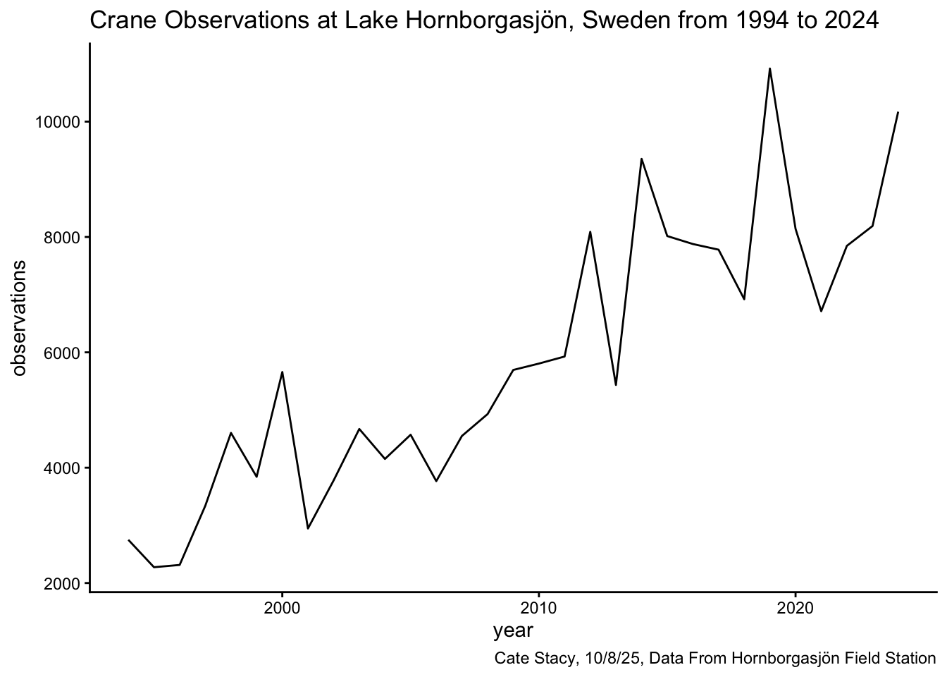
This line graph confirms the theory that the crane population has increased over the years, but it reveals that the increase has not been steady. There are several years where the crane population dropped dramatically.
Code
cranes_new %>%
  filter(!is.na(date) & !is.na(observations)) %>%
  group_by(month) %>%
  summarize(mean_observartions = mean(observations)) %>%
  ggplot(aes(x = month, y = mean_observartions, fill = month)) +
  geom_col() +
  theme_classic() +
  labs(y = "observations", title = "Monthly Crane Observations at Lake Hornborgasjön, Sweden from 1994 to 2024",
       caption = "Cate Stacy, 10/8/25, Data From Hornborgasjön Field Station")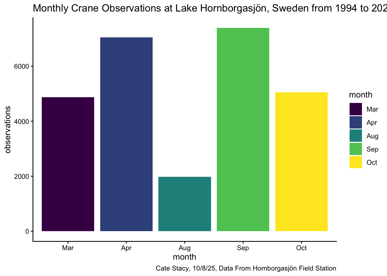
For the most part, this bar chart is in agreement with the trends observed in the heatmap, but there are some slight discrepancies. Based off the heat map, I would have guessed that April had the highest mean number of observations, followed by October, then September. The bar chart, however, displays September as having the highest mean. This could have to do with the plot grouping all of the years together.