TidyTuesday 09/09/2025
TidyTuesday Section (optional)
You can count work on this week’s TidyTuesday toward the exceptional work required for an A in the Homework component.
Explore the week’s TidyTuesday challenge. Develop a research question, then answer it through a short data story with effective visualization(s). Provide sufficient background for readers to grasp your narrative.
Importing Data
Reading in the data about individual countries as well as their rank by year. In this case they were scored based on the number of destinations that passport could travel to with no visa requried. This plays into the rank of the passport which is essentially its travel power.
Research Question: How has the power of different regions passports shifted over time? What is the most powerful passport?
Exploring the Data
Code
# A tibble: 7 × 3
  region      Mean_Visa Mean_rank
  <chr>           <dbl>     <dbl>
1 AFRICA           49.7      77.5
2 AMERICAS        109.       36.0
3 ASIA             68.4      65.6
4 CARIBBEAN        95.7      45.8
5 EUROPE          131.       22.4
6 MIDDLE EAST      57.0      74.0
7 OCEANIA          92.6      45.2
In this table we can see that that Europe has the best overall mean rank for its countries and that passports from Europe tend to be let into a lot more countries. This is then followed by passports from the Americas, then the Caribbean. In last place is Africa.
Visualizations
In order to get a better idea on how these trends have changed overtime I created the following visualizations.
Code
region <- country_expanded |>
  mutate(visa_free_count = as.numeric(visa_free_count)) |>
  group_by(region, year) |>
  summarise(Mean_Visa = mean(visa_free_count), Mean_rank = mean(rank))

region |>
  ggplot() +
  geom_line(aes(x = year, y = Mean_Visa, color = region), stat = "smooth", size = 2) +
  theme_classic(base_size = 13) +
  scale_y_continuous(limits = c(0,200), breaks = seq(0, 200, by = 50)) +
  scale_x_continuous(limits = c(2006,2025), expand = c(0,0)) +
  theme(
      panel.grid.minor = element_blank(),
      axis.ticks.x = element_blank(),
      plot.title = element_text(face = "bold", size = 15),
      plot.title.position = "plot",
  ) +
   scale_color_viridis_d() +
  labs(title = "Average number of visa free entries over time", subtitle = "per region of the world", x = "Year", y = "Mean Visa Free Count", color = "Region", caption = "Made by: Tori Duckworth, Date: Sep.15,2025, Source: TidyTuesday 09-09-25") +
  geom_vline(aes(xintercept = 2013), linetype = "dotted", color = "gray50") +
  geom_text(aes(x = 2014, y = 200, label = "2013"), color = "gray50", size = 4) +
  labs(alt = "alt.text = line graph showing the average number of countries a passport can enter without a visa per region over time. We can clearly see that Europe has the most passports that can visit the most counties without visas, followed by the Americas, and despite rising overtime they have not changed position. Following behind them is the caribbean followed by oceania, which are now about the same level in recent years. Then passports from Asia, the Middle east and Africa follow. There is a line marking 2013 as that is when there seems to be a global shift in the trend of allowing more visa free travel, going from a steady about 45 degree angle incline to plataueing for a year, followed by a much slower climb")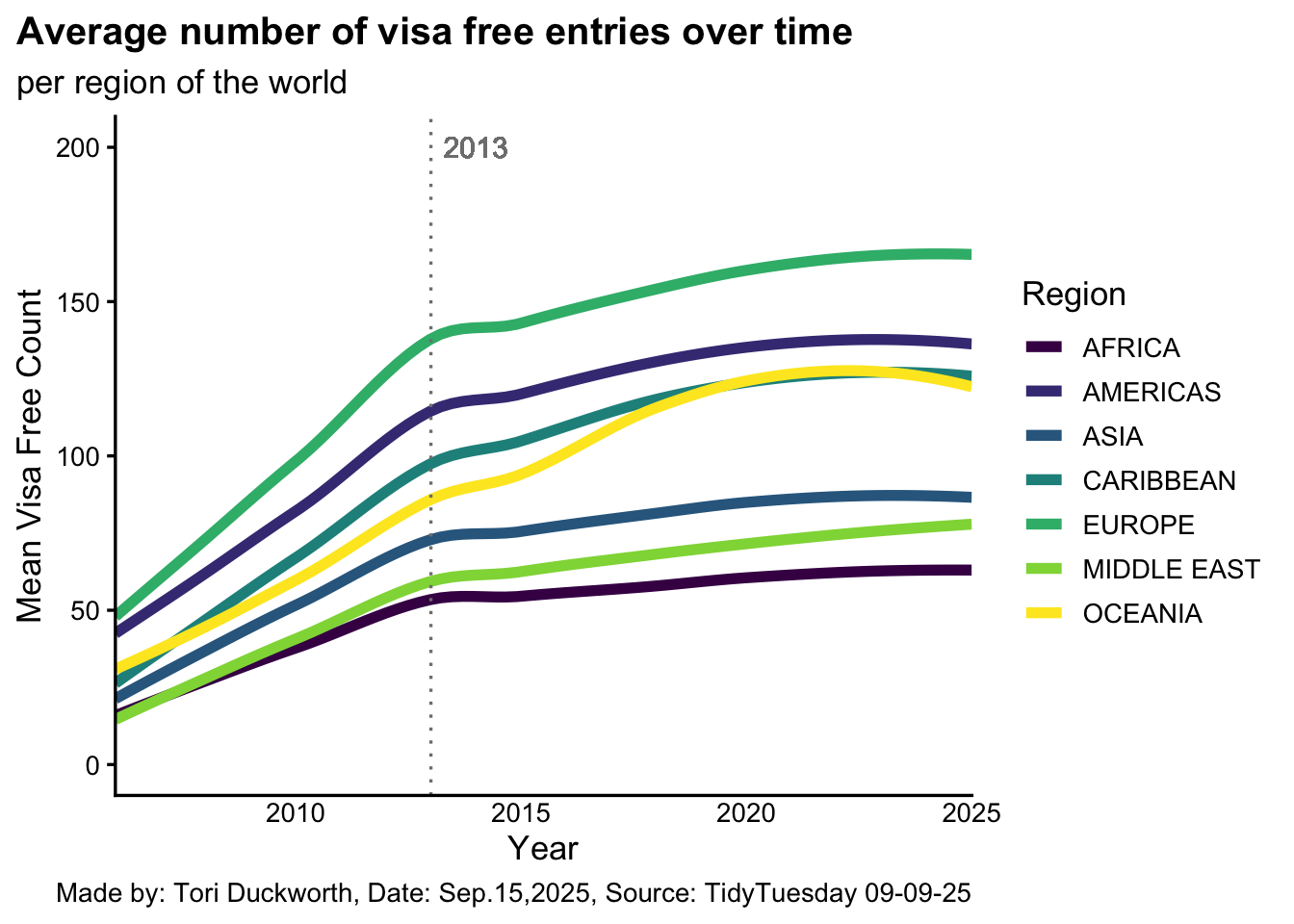
In this visualization we can clearly see that the mean number of countries each region’s passports allow people into without visas has increase overtime. In fact they were all following a similar slope until 2013 where there was a significant bump and then most regions plateaued before steadily rising a lot slower. It is unclear what global event could have caused this stalling in the rise of freedom to travel, but the pace has not quite recovered.
Code
Best_passport <- country_expanded |>
  filter(region == "EUROPE") |>
  mutate(rank = as.numeric(rank)) |>
  group_by(country) |>
  filter(any(rank == 1)) |>
  ungroup()

Best_passport |>
  ggplot() +
  geom_line(aes(x = year, y = rank, color = country), stat = "smooth", size = 2) +
  theme_classic(base_size = 13) +
  scale_y_continuous(limits = c(0,7), breaks = seq(0, 7, by = 2)) +
  scale_x_continuous(limits = c(2006,2025), expand = c(0,0)) +
  theme(
      panel.grid.minor = element_blank(),
      axis.ticks.x = element_blank(),
      plot.title = element_text(face = "bold", size = 15),
      plot.title.position = "plot",
  ) +
   scale_color_viridis_d() +
  labs(title = "Best Passport Overtime", subtitle = "from Europe", x = "Year", y = "Rank", color = "Country", caption = "Made by: Tori Duckworth, Date: Sep.15,2025, Source: TidyTuesday 09-09-25") +
  scale_y_reverse() +
  labs(alt = "This graph shows 8 European countries who have all been ranked number one at some point from 2006-2025.  Denmark was ranked the best for about 8 years, until around 2013 when both Sweden and the UK were around first. Then Germany became the top rated passport and remained that way until 2025 when Spain over took it. There is a lot of fluctiation between countries and over time.")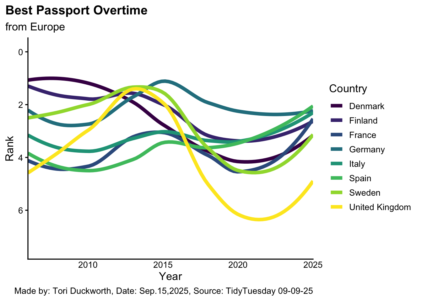
By looking at this graph, it seems that Denmark was ranked the best for about 8 years, until around 2013 when both Sweden and the UK were around first. Then Germany became the top rated passport and remained that way until 2025 when Spain over took it. However, while this graph shows the changes it doesn’t give us a definitive answer, which I do in the following short table.
# A tibble: 8 × 2
  country        Mean_rank
  <chr>              <dbl>
1 Germany             2.2
2 Finland             2.4
3 Denmark             2.65
4 Sweden              2.9
5 Italy               3.3
6 Spain               3.65
7 France              3.95
8 United Kingdom      4.15
Through this we can in fact see that Germany has been most consistently the top rated passport. However Finland and Denmark are not far behind. Despite one time taking the first place spot, the UK is last of the 8 European countries in terms of consistent rank.
All in all these visualizations tell us that the rate of the number of countries each passport can get a holder in somewhere has slowed down compared to the early 2000s, although still is increasing. Individiuals from Europes passports on average get them into many more countries without a visa, around 131 to be exact, while if your are a German passport holder you have the ultimate travel power.